LinkedIn Background Photos: promoting yourself or your business for free 24/7
One of the first things that catches your eye when visiting a LinkedIn profile is the background photo at the top. At least, it might if it’s not the blank blue default image!

But too often people ignore the background photo area. When that happens, the owner of the profile has lost a key opportunity to gain your attention, summarise their area of expertise or persuade you to become part of their network.
Think about your own LinkedIn activity. If you happen across a profile with an eye-catching background photo, an intriguing tagline, a logo and perhaps even a call to action – are you more likely to stop and take note? Perhaps think about whether to connect with that person? Or delve further into their profile to find out more?
The answer is most likely to be yes.
So, it’s a major mistake to ignore LinkedIn background photos – especially for those who are serious about marketing themselves on LinkedIn. It also sends the message – correct or not – that you don’t take LinkedIn seriously.
This article looks at how to use your background photo to stand out from the competition on LinkedIn and entice people to view your profile and then to connect.
5 Reasons to Personalise the Background Photo
Before we look at techniques for creating LinkedIn background photos with the Wow factor, let’s look at why paying attention to this part of your profile is important.
- First impressions – As this is one of the first elements of your profile someone will see, you want to make a good impression.
- Visual impact – Nothing shouts ‘boring’ so much as that big blue header. Blue is a subdued colour when what you want is to create impact in the form of colour, images and text.
- Opportunity cost – By not using the background photo area to full advantage, profile owners are missing the opportunity to promote themselves, their product or their services.
- Competitive advantage – When a potential client is looking for a supplier, they will be more drawn to a profile that stands out. Not utilising this space gives your competition an edge.
- Implied message – Profile holders who don’t use this space are seen as being less interested in or active on LinkedIn (whether or not this is true). The perception will be one of disinterest in the platform.
Using the background photo effectively is a no-brainer if you want to create a good impression, provide visual impact, reduce opportunity cost, gain competitive advantage and send the right message to profile viewers.
What NOT to Put in LinkedIn Background Photos
You’ve decided to take action on your background photo and get it up to scratch. How can you make it attention-grabbing and eye-opening? For this, it’s probably best to start with what not to do. This is my list of don’ts.
?Repeating your profile photo. I spotted a profile photo of a woman showing off an impressive expanse of chest recently which she had used not once, but twice – both in her profile image and the header. It could be argued that this definitely had the Wow factor, although whether it was the right kind of ‘wow’ would be up to the viewer.
?Placing content where it can’t be seen. When viewed on a desktop, the profile photo displays over the left area of the background photo; on mobile it is placed in the middle. Text or images in these areas will obscured by the profile photo.
?Jamming it with too much content. The perspective of the background photo changes between mobile and desktop with mobile dominated by the profile photo, which makes the text appear much smaller. Because so many people use LinkedIn on their mobiles, bear this in mind when designing the header area.
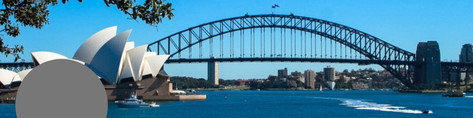
?Using an irrelevant or generic image – cityscapes are particularly popular where people can’t come up with a more representative image of their brand or work.
What SHOULD Go in LinkedIn Background Photos

The choice of what to include in your background photo is only limited by your creativity but here are some of the elements that work best:
Background – choose one that works with your brand in terms of colours. The lighter it is, the better your other elements will stand out.
Image – if you have a suitable sized and shaped image, it might also look great as the background photo. This gives you a choice to add text or not. Many people have images of their city, often with nothing else which provides only one piece of information – their location. I’ve also seen images of traffic cones and river stones in LinkedIn background photos but without any text. A brave decision if there is no clear link between the image and the person’s line of work. But ideal, of course, if the person displaying traffic cones is involved with roading.
Adding text would certainly provide more information but could look very cluttered and hard to read. I’d suggest a cityscape only as placeholder while a permanent background photo is being prepared.
Text – brevity is key here. Space is limited so choose what is most impactful. It could be an attention-grabbing headline, your business tagline, what you do and who for, or even a call to action. The decision you make will depend on your line of business, whose attention you want to attract and your flair with words.
Text size and font – make it as large and as simple as possible so it is easily readable on mobile as well as desktop. Proportions change between the two; where they might look suitably large on desktop, they may be too small to be easily read on a small mobile screen.
Large text in a sans serif typeface (no tails on letters, as seen in Arial and Calibri) will have instant impact in a header, all other things being equal. On mine, the main text is in 48pt, the website address in 32pt and that is really too small now I look at it on mobile.
Logo – Most logos lend themselves to be included on a background photo but their shape will determine how large they need to be. For example, a long thin logo will need to be larger than a square or round one to be visible on mobile, so will take up more space. When using a logo, be sure to place it where it won’t be partially or fully obscured by your profile photo no matter whether it is viewed on mobile or desktop.
Other elements – the LinkedIn background photo is an excellent place to display awards won, logos of media you’ve been featured in and, if this is your thing, an image of you with someone famous. While not a fan of this latter technique myself, I can see the appeal. If I had a photo of me meeting Bob Bly (a copywriting heavyweight), Dr Ivan Misner (founder of BNI) or Naomi Klein I’d be tempted to put it in my cover image, too! But given that my days of meeting the famous and powerful preceded selfies, that is unlikely to be a temptation I will have to face.
Professional design – if, like me, design really isn’t your strength then choosing a professional designer to create your background photo is a sensible idea. Especially if you don’t intend to change it again for some time. I tend to change mine regularly so do it myself in Canva but there is no doubt a professional designer would provide a better result. The choice, ultimately, is yours.
The Technical Details of LinkedIn Background Photos
Not sure how to change your background photo or what’s involved? Here’s how to do it.
The first thing you need to know is that the background photo is just that – a photo. So, it needs to be created outside LinkedIn in another program, Canva for example, and saved then uploaded as an image file. It isn’t possible to edit or change the background photo from within LinkedIn.
To access the background photo go to View My Profile and click on the blue editing pen (it’s on the right next to the More button). In the top right of the background photo is another editing pen. Click this. (It will likely tell you the recommended size of the image you need to upload – 1584 x 396px.)
This is where you upload the image and edit it until it looks good when saved. The image can be zoomed, straightened, cropped, filtered and adjusted. Saving it is a two-step process – click Apply and when the next screen opens, click Save.
Profile photos appear on the lower left of the cover image when viewed on a desktop. On a mobile, it is in the middle. This makes it quite difficult to use all the available space and optimise it best for both.
Wrapping it all up
Using both words and images, it is super-easy to create LinkedIn background photos that are eye-catching and targeted. They can contain a tagline, headline, logo, website, photo and other elements specific to your line of work and preferences.
Remember that LinkedIn background photos display differently on mobile and desktop, both because of where the profile image is positioned and the perspective between text and profile image.
Keep LinkedIn background photos simple and uncrowded, but colourful and impactful, and you can’t go far wrong.